
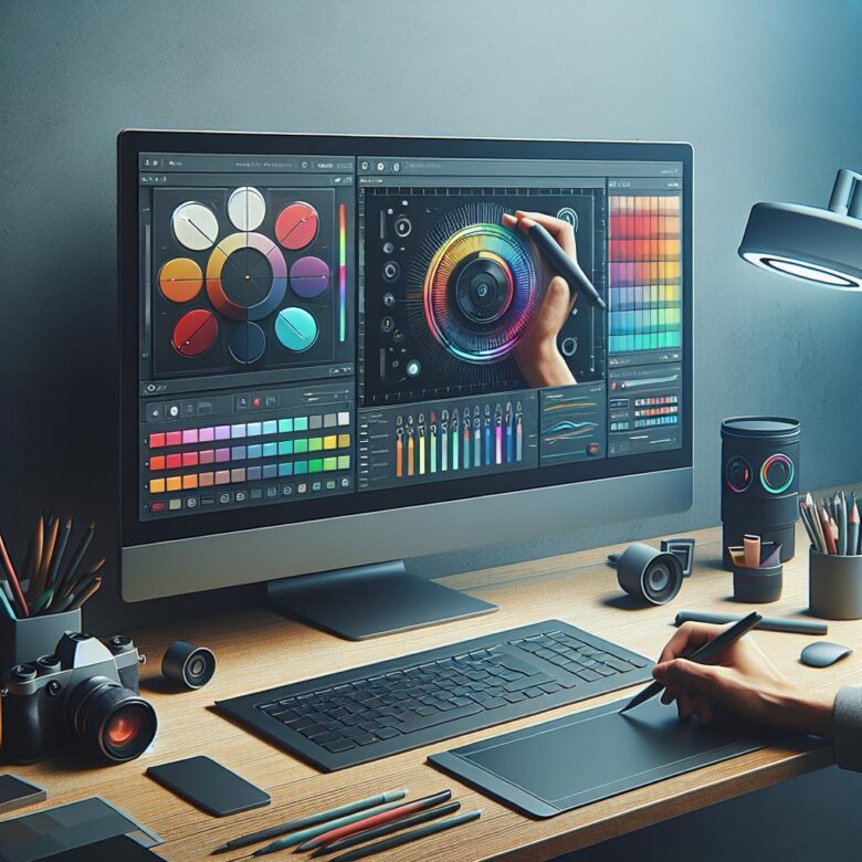
Most edits fail at the color stage. Good exposure and sharp detail still fall apart when skin tones drift, shadows turn muddy, or a grade looks cinematic on one screen and unusable on another. I’ve seen photographers waste hours chasing “better color” with random sliders, only to deliver inconsistent galleries and lose client trust.
After years working across Lightroom and Capture One workflows, one pattern is constant: strong color grading is not about taste alone-it’s about control, repeatability, and knowing which tool solves which problem. Ignore that, and you pay in revision time, weak portfolio cohesion, and images that never quite feel finished.
Below, I break down the exact workflow to build clean, intentional, professional color using Lightroom and Capture One-from balancing tones and separating color channels to creating repeatable looks that hold up across entire shoots.
Lightroom vs. Capture One Color Grading: Expert Strategies for Precise Tones, Skin Accuracy, and Cinematic Looks
Most color failures happen before the creative grade: Lightroom users often push global HSL too far, while Capture One users over-rely on broad Color Editor masks and introduce hue contamination in skin. The practical difference is precision-Capture One isolates narrower hue ranges with cleaner falloff, while Lightroom’s newer masking and Point Color tools in Adobe Lightroom Classic close the gap for targeted tonal control.
| Goal | Lightroom Strategy | Capture One Strategy |
|---|---|---|
| Skin accuracy | Use Masking + Point Color to shift orange/red locally, then balance luminance before saturation to avoid waxy skin. | Use Skin Tone in the Color Editor with Uniformity sliders to normalize hue and saturation while preserving micro-contrast. |
| Cinematic separation | Build contrast with Color Grading wheels in shadows/midtones, then refine highlight roll-off via Tone Curve. | Use Advanced Color Editor on selective layers and control depth with Luma Curve for denser shadow color without clipping. |
| Consistent camera rendering | Start with a camera-matching profile, then neutralize WB drift before grading. | Leverage ICC profiles and Base Characteristics first; grading is more predictable once vendor color bias is removed. |
Field Note: On a mixed-light fashion set, I recovered magenta-polluted cheek tones faster in Capture One Pro by isolating the affected hue on a layer, but matched the final cinematic palette in Lightroom only after splitting luminance and saturation corrections into separate masks.
How to Build a Professional Color Grading Workflow in Adobe Lightroom and Capture One Using Curves, Color Wheels, and Layers
Most inconsistent grades come from stacking global adjustments before establishing tonal separation; once highlights clip or skin rolls into the wrong hue angle, every later move fights the image. In both Lightroom and Capture One, a professional workflow starts with exposure normalization, then curve-based contrast shaping, then targeted color refinement on isolated layers.
| Stage | Lightroom / Capture One Action | Technical Goal |
|---|---|---|
| Base Grade | Use RGB Point Curve for contrast, then Hue/Sat/Lum to neutralize problem channels | Set black point, preserve highlight latitude, and correct channel bias before creative grading |
| Color Separation | Apply Color Wheels for shadows, midtones, and highlights; keep shifts subtle and balanced against WB | Create controlled warm/cool contrast without contaminating neutrals or skin |
| Selective Refinement | Build local masks or layers in Capture One Pro or Lightroom masking, then fine-tune with Luma Curve | Grade subject, background, and skin independently for repeatable, client-ready consistency |
Field Note: On a mixed-light commercial portrait set, I recovered a magenta-contaminated jawline by putting skin on a separate Capture One layer, flattening the red curve response, and reducing midtone wheel density instead of touching global white balance.
Advanced Color Grading Tips for Lightroom and Capture One: Master White Balance, HSL Control, and Selective Color Adjustments
Most grading failures start with white balance drift, not “bad color.” A 200-400K mismatch between frames will break skin-tone continuity faster than any split-toning preset, especially when moving between mixed LED and window light in Adobe Lightroom Classic or Capture One Pro.
- White Balance: Set WB from a neutral reference first, then fine-tune Tint while watching skin reds and shadow greens separately; in Capture One, use the Skin Tone tab only after WB is locked, otherwise uniformity corrections amplify cast errors.
- HSL Control: Avoid broad saturation pushes; target hue shifts in 3-8 point moves, then lower luminance slightly to add density without clipping channel detail. In Lightroom, Orange and Yellow often overlap in skin, so isolate with masking before global HSL changes.
- Selective Color Adjustments: Use local masks for problem ranges such as cyan spill in shadows or magenta contamination in practical lights. In Capture One, Advanced Color Editor selections are cleaner than global sliders for product work where brand colors need delta-level consistency.
Field Note: On a cosmetics campaign, I fixed inconsistent foundation tones across 46 frames by syncing WB numerically first, then using Capture One’s Advanced Color Editor to contract the orange hue range by 4 points instead of pushing global saturation, which preserved packaging reds and cut retouch time by nearly half.
Q&A
1. What is the best way to start color grading in Adobe Lightroom and Capture One without making photos look unnatural?
Begin with a clean, technically balanced image before applying any creative color work. Correct exposure, white balance, contrast, and basic tonal range first. In both Adobe Lightroom and Capture One, strong color grading works best when the file already has accurate highlights, shadows, and skin tone balance.
- Set white balance before adjusting color mood.
- Use HSL/Color Editor to refine individual colors instead of shifting everything globally.
- Apply subtle changes to shadows, midtones, and highlights separately.
- Check skin tones frequently, especially when adding teal, orange, green, or magenta casts.
- Reduce saturation before increasing it again selectively for better control.
In Lightroom, the Color Grading panel is ideal for tonal color separation. In Capture One, the Color Balance tool and Advanced Color Editor offer more precise color targeting. The most common mistake is pushing saturation too far; professional results usually come from restrained, layered adjustments.
2. Should I use Lightroom or Capture One for advanced color grading?
Both are capable, but they differ in workflow and precision.
| Feature | Adobe Lightroom | Capture One |
|---|---|---|
| Ease of use | More intuitive for most users | Steeper learning curve |
| Color grading tools | Strong global and tonal grading controls | Excellent selective color control |
| Skin tone correction | Good, but less specialized | Especially strong with Skin Tone tools |
| Layer-based workflow | More limited | More flexible for complex edits |
| Best for | Fast, efficient grading and catalog workflow | Precision color work and studio-quality control |
If you want speed and a simpler workflow, Lightroom is often enough. If you need granular control over specific hues, consistent skin tone rendering, or layered color adjustments, Capture One is often the stronger choice.
3. How can I create a consistent color grading style across an entire photo set?
Consistency comes from standardizing your correction process before applying any creative look. Do not grade each image from scratch. Instead, build a repeatable workflow and apply a base grade across similar images.
- Create a reference image with your finished look.
- Sync or copy only the relevant adjustments across the set.
- Use consistent white balance and exposure as the foundation.
- Group images by lighting condition rather than grading the whole shoot identically.
- Use presets or styles as a starting point, then refine image by image.
- Compare multiple photos side by side to catch color drift.
In Lightroom, use Copy/Paste Settings, Sync, and presets carefully. In Capture One, use Styles, Variants, and layer-based adjustments for better control. A consistent style is less about applying the same preset everywhere and more about maintaining stable skin tones, contrast relationships, and color harmony across the set.
Closing Recommendations
Color grading stops looking “cinematic” the moment consistency breaks across a full set. The strongest edits are rarely the most dramatic-they are the ones that hold skin tones, neutrals, and mood together from first image to last, whether you work in Lightroom or Capture One.
Pro Tip: The biggest mistake I still see is grading on an uncalibrated display and then chasing corrections across every export. If you only implement one thing from this guide, make it a monitor calibration routine and a small set of trusted reference images before touching color wheels or curves.
Right now, create a folder with 5 reference photos, calibrate your display if you haven’t already, and build one reusable grading preset or style from a single well-edited image. That one move will improve every session that follows.
Dr. Julian Mond is a visual storyteller and researcher dedicated to the intersection of light, history, and human emotion. With a doctorate in Visual Arts, he combines academic precision with a cinematic eye to transform fleeting moments into timeless narratives. Through Mond Photos, he explores the world as a living gallery.